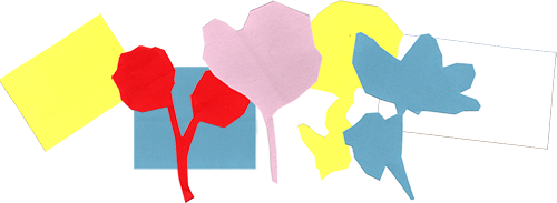
I wanted to make something botanical and graphic using these collected flowers from a wedding magazine. I scanned the cuttings and negative-space sheet in grayscale. My scanner is pretty old and a bit broken, but I find this only adds to the lo-fi grain I’m after. Removing the colour gave me complete control over the new colour application, supporting the high contrast graphic approach I had in mind.
I usually work with 3 to 6 colours per piece, selected from my wider palette. Here, I tested 10 colours, a mix of bold brights and softer tones, to see which combinations worked best both in isolation and alongside one another.

Because I blend digital and analogue techniques, I pulled out papers, paints, pastels and Posca pens. If the digital stages are more considered, these analogue moments are deliberately loose and playful. The aim was simply to build a small library of textures, paint blobs, scribbles and brushstrokes, that I could scan and weave through the layers of the final collage.
Once I've brought everything into Photoshop, it’s time to test compositions. This is the most important part of the process, as it’s where the final collage slowly begins to reveal itself. I try to stay patient and open-minded, resisting the urge to get too attached to one idea before I’ve explored lots of options. While none of these compositions felt quite right, the experimentation helped me identify my strongest colour combinations, how to incorporate the handmade textures, and the most effective approach to scale, placement and layering.

I realised my tests were too busy and arrived at a more stripped-back approach: individual flower compositions using just 3 to 4 colours. Each collage contains one hero flower against a single graphic shadow, retaining some of the alphabet lettering from the original paper scan. These elements sit on colour blocks with handmade textures embedded within them.
I created four simple collages that, when brought together, form one larger composition made up of four quadrants. With the structure decided, I wanted to introduce more analogue texture back into the piece. Using my chosen compositions as “blueprints”, I reconstructed each section by hand to bring back raw scissor-cut edges and paper grain. I printed the compositions and used them as cutting guides over pieces of card and paper in similar colours, effectively recreating each individual shape. I then scanned everything back into Photoshop, ready for the final build.

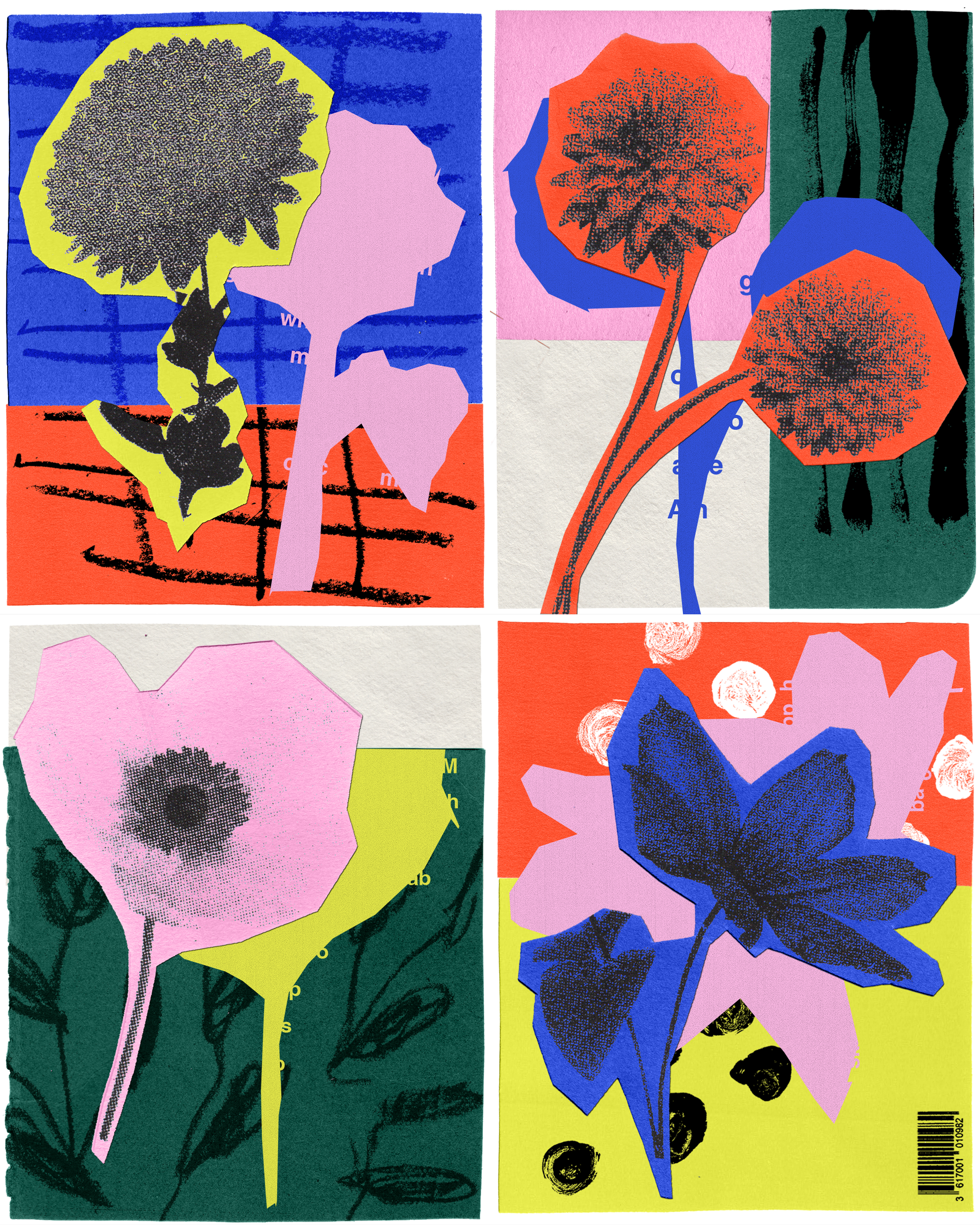
Paper textures, scanner grain, scissor-cut edges, handmade marks and natural shadows sit directly alongside graphic bold shapes and open blocks of colour in this floral collage artwork. For me, the balance between analogue imperfection and graphic simplicity is what makes this piece exciting. The handcrafted layers and vibrant tones are true to my visual language, but this piece pushed me towards something more stripped-back and graphic. By embracing negative space, fewer colours and a single hero flower within each quadrant, I’ve allowed the individual elements breathing room. The result feels simpler and clearer compared to some of my more maximalist textured work.
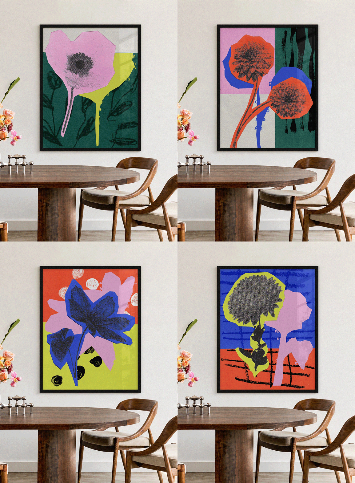
These prints are available for purchase for your home interiors and wall gallery. Check out my online print shop:
https://eastsidestudiolondon.co.uk/collections/sian-roper-art-prints