
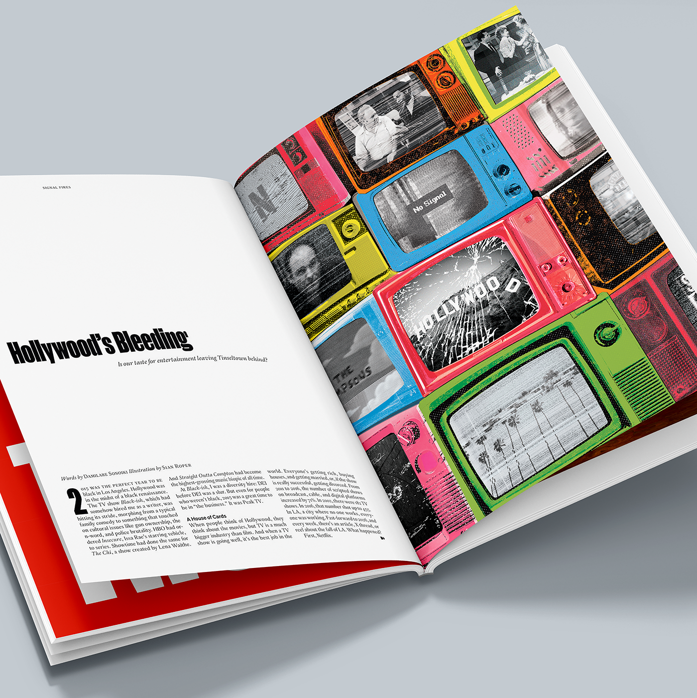
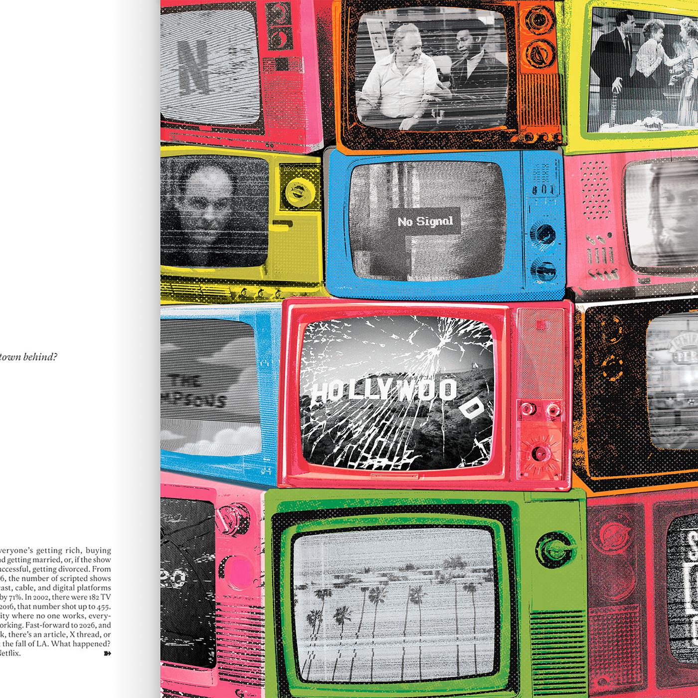
For Issue 6 of Frontier Magazine, produced by Blaze Media, I was pleased to contribute an editorial collage illustration to accompany the article Hollywood's Bleeding, which explores the slow cultural and economic decline of Hollywood's once thriving entertainment industry.
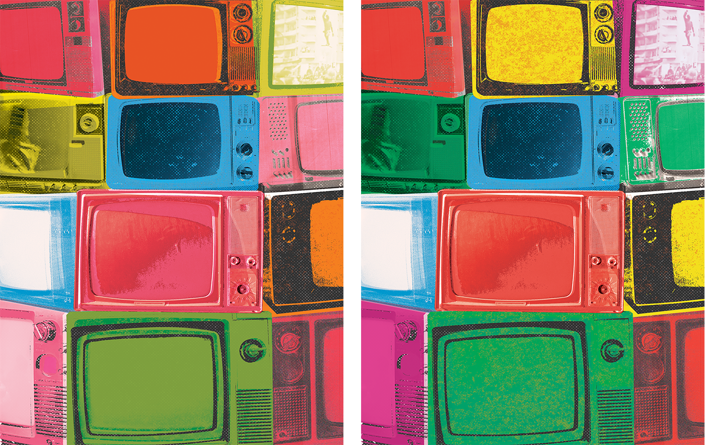
The key visual themes were television, Los Angeles, nostalgia, decay and the challenges of the streaming era. The image of a towering stack of old television sets, each buzzing with static and glitching screens, came to me almost immediately. It felt like the perfect way to capture the article's central ideas while creating a bold, eye-catching composition. I explored two colourways and several variations of the screen content before arriving at the final illustration.
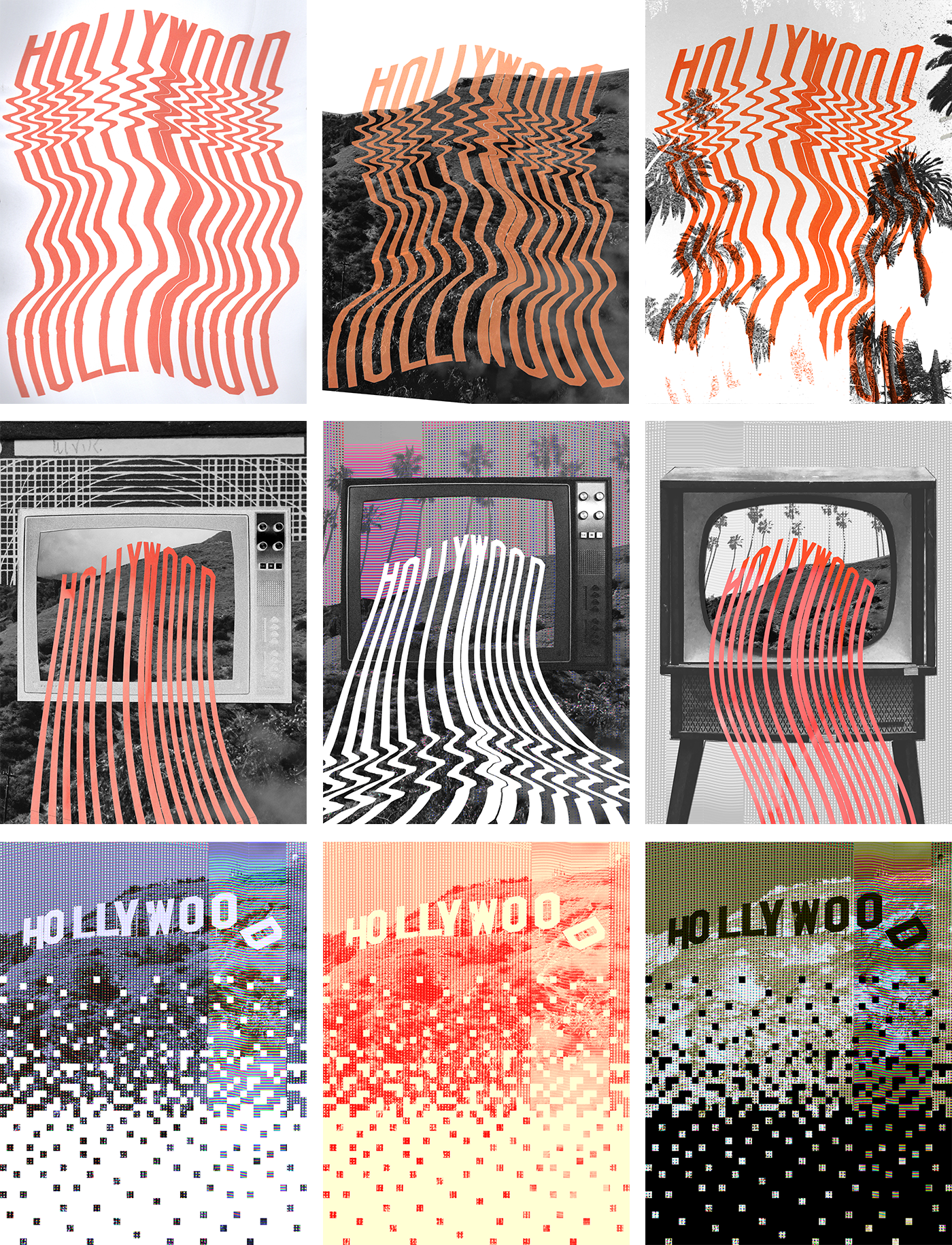
Alongside this, I also explored other ideas. Inspired by the article's title, I experimented with the Hollywood sign literally bleeding. By stretching and scanning printed lettering across the scanner bed, I created distorted, dripping letterforms that produced some wonderfully unpredictable outcomes. Although it was an enjoyable process, the idea never developed into a concept that felt strong enough to carry the finished piece. I was also drawn to the idea of the Hollywood sign breaking apart into eroding digital pixels, but in the end it felt a little too simplistic. Exploring these different avenues ultimately gave me confidence that the stacked televisions were the strongest and most effective visual solution.
Many thanks to Peter and Miguel for inviting me back for another issue of this fantastic publication!